Step 1
Find yourself a nice photo of a wall to put your logo on (i found this image on the internet with Google Images). Every image is suitable if there is a suitable structure (no smooth walls!).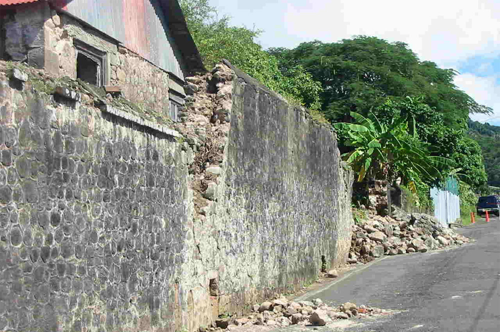
Step 2
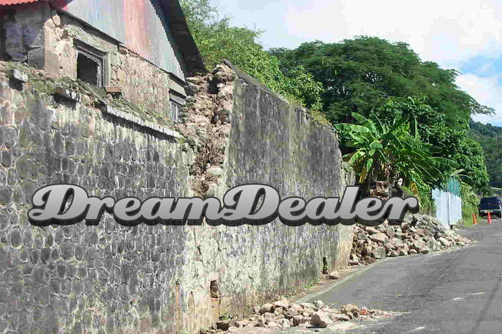
Place the logo you want to use in a new layer. The logo has to be a pixel-based image (no fonts, paths and shapes) because in the next step we will apply a "perspective transfer" wich requires the layer to be pixel-based.
Step 3
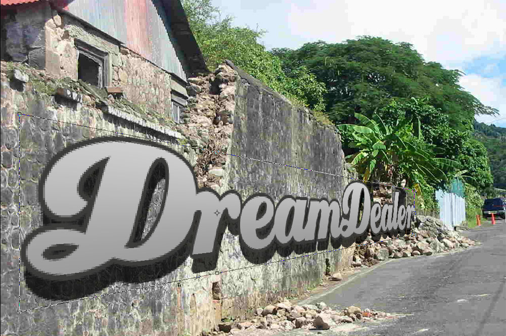
Select "perspective transform" in the edit-menu en change the aspects of the logo that it fits the perspective of the wall. When you mak a "perspective transform" the selection you're transforming gets a bounbing box. You can use the lines of this bounding box to align the logo with the wall.
Step 4
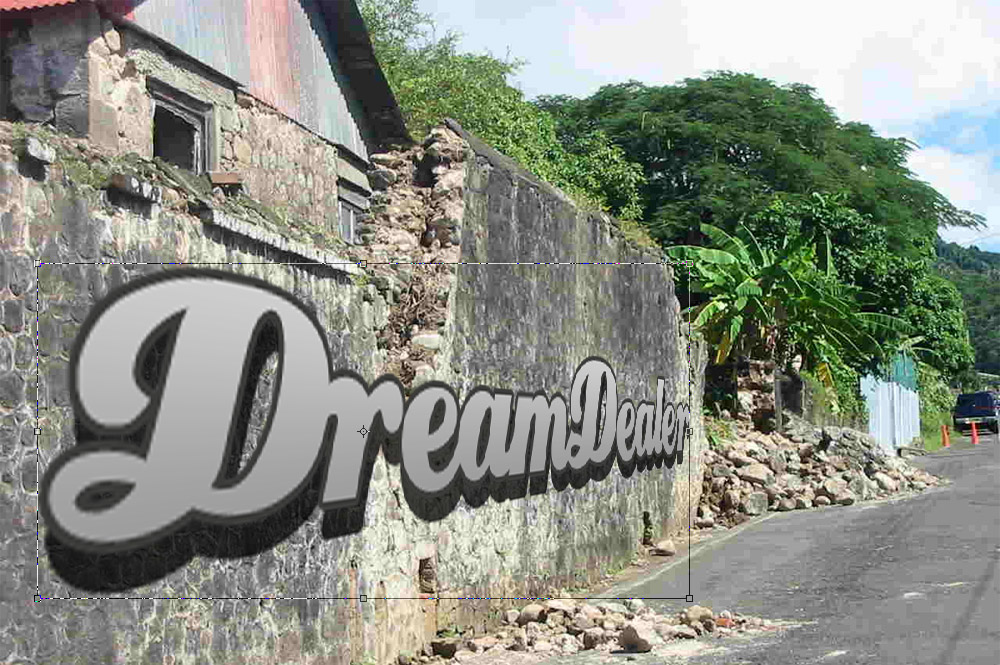
The logo was just a bit to wide, but thats no problem. You can adjust this with the normal transform tool (CTRL+T). Make it a bit smaller so it will fit nicely in the wall. If the perspective of the logo doesn't look realistic, redo the previous steps, because the realism of this is the most important.
Step 5
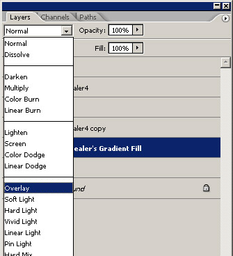
After this, put the blending mode of the logo layer to "overlay":
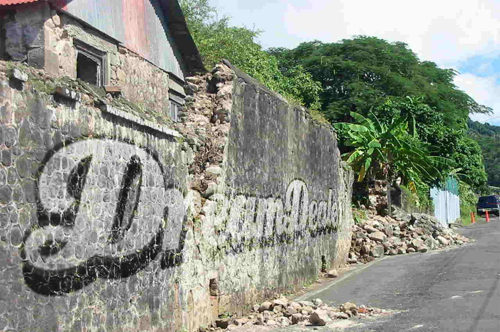
The result:
Step 6
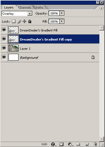
The logo still has sharp edges and looks more like a sticker than a graffiti drawing. To make this a bit more realistic we are going to blur the edges a bit. To blur only the edges, but not the logo, you'll have to make a copy of the layer and place it under te original logo.
Step 7
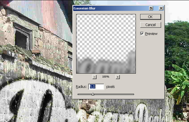
The, blur the copied layer with a "Gaussian Blur" with a value of 5,0 pixels. The gaussian blur is found in the filter-menu.
Step 8
At last, to improve the realism, use the eraser tool to erase the logo where the wall is worn down.
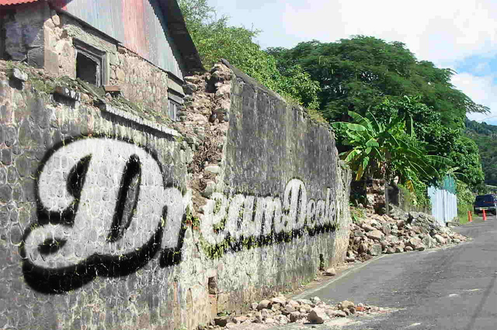
Verfijnen
If you like the vague version of step 5 more, but with the blurred edges, you can select the blurred layer and click (while holding CTRL) on the thumbnail of the original logo layer. This way you'll select the outlines of the original layer. If you've done this, press DELETE to delete the selected part from the blurred layer.
To make it all even more realistic, you can place another graffiti (a more worn down one) on the wall of erase more from the logo to make it look more worn down.


No comments:
Post a Comment